Siamo lieti di annunciare il lancio del nostro nuovo logo aziendale, che rappresenta un'importante pietra miliare nella continua crescita di Xiamen Jinke Weiye Printing Co., Ltd.
Questa identità visiva rinnovata riflette non solo la nostra evoluzione come produttori professionali di etichette, ma anche i valori fondamentali che guidano ogni nostra azione.
Il significato dei colori
Il nostro nuovo logo incorpora quattro colori chiave, ognuno dei quali rappresenta un aspetto fondamentale del nostro marchio:
- Blu – Fiducia e professionalità
Il blu riflette il nostro impegno nel fornire soluzioni di stampa di etichette precise e affidabili. Rappresenta la fiducia che i nostri clienti ripongono in noi e la nostra dedizione a mantenere standard elevati in ogni progetto.
Il rosso simboleggia la nostra passione per la stampa e il nostro forte impegno per la qualità. Sottolinea la nostra volontà di creare etichette resistenti e dai colori vivaci, capaci di lasciare un'impressione duratura.
- Giallo – Ottimismo e visibilità
Il giallo trasmette energia, positività e grande visibilità. Rappresenta la nostra capacità di produrre etichette accattivanti che si distinguono sugli scaffali e valorizzano l'attrattiva del prodotto.
- Verde – Innovazione e crescita
Il verde è sinonimo di innovazione e miglioramento continuo. Riflette il nostro approccio lungimirante e il nostro impegno nello sviluppo di nuove soluzioni per le diverse esigenze di etichettatura.
Più di un semplice logo
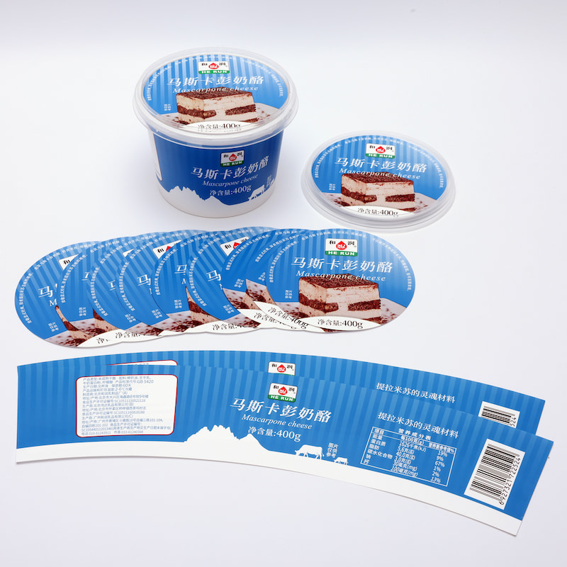
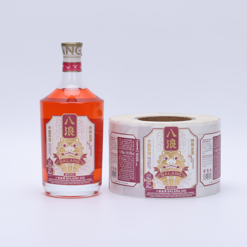
Questo nuovo logo è più di un semplice aggiornamento visivo: rappresenta la nostra visione per il futuro. Grazie ad attrezzature all'avanguardia, tra cui la stampa flessografica e offset multicolore, siamo più che mai in grado di servire clienti globali nei settori alimentare, delle bevande, cosmetico e industriale.
Andando avanti
Nel nostro percorso verso la nuova identità, restiamo impegnati a:
Forniamo soluzioni di etichettatura personalizzate di alta qualità.
- Supportiamo i nostri clienti con un servizio professionale.
- Innovare costantemente per soddisfare le esigenze di un mercato in continua evoluzione.
Non vediamo l'ora di crescere insieme ai nostri partner in tutto il mondo sotto questa nuova e significativa identità di marca.


 Italiano


 Sales Executive